Using links in Flow Monitor dashboard reports
Each Flow Monitor dashboard report contains links that allow you to refine the data displayed in the report. When you click on the data in the first column of one of the dashboard report's rows (or on a pie graph's wedges, or a bar graph's bars), the Flow Interface Details report appears with the selected data applied as a filter.
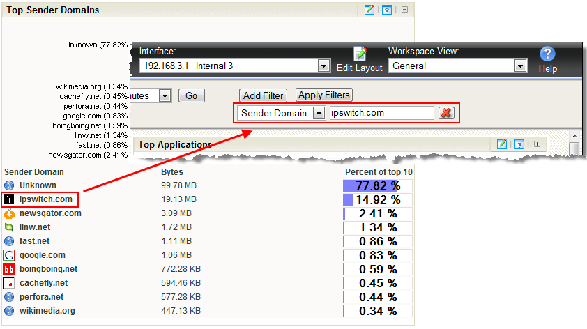
For example, as illustrated in the graphic below, if you click on ipswitch.com in the Top Sender Domains dashboard report, the Flow Interface Details report appears with a Sender Domain filter set to ipswitch.com.

If you are viewing the Flow Interface Details report with a filter applied, clicking a link in a dashboard report refreshes the report with the selected data applied as an additional filter (the previously applied filters remain).