About the Ping Availability report
This performance report displays ping availability data collected during the selected time period for the device or group displayed at the top of the report.
- Configure the data collection for a device by right-clicking the device in the Device list and selecting Properties > Performance Monitors, then selecting Ping Latency and Availability > Configure.
- Configure the data collection for a group by right-clicking a group in the Device list, selecting Bulk Field Change > Performance Monitors, and then making a selection from the Ping menu.
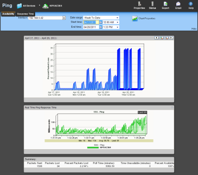
Device Report: |
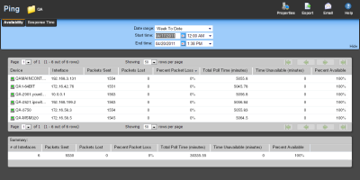
Group Report: |
|
|
Monitor report body for device reports
Below the date/time picker is a graph showing device ping availability for the selected time period. Each point on the graph corresponds with an entry in the graph data table below.
Changing how the chart looks
Click the Chart Properties button to change how the report chart is displayed.
Split Second Graph - Real Time Ping Availability for devices
Under the main report graph is a Split Second Graph that displays real-time ping availability data.
Note: Split Second Graphs are not available in WhatsUp Gold Standard Edition.
Note: Split Second Graphs are not available in VMware host reports.
Note: When viewing information for devices running Microsoft Windows, information gathered via WMI is displayed in real time. Information gathered by SNMP, however, may reflect a delay of one minute or more. This delay is caused by a limitation in how often Microsoft Windows updates SNMP values.
Below the Split Second Graph, the report displays general ping availability information for the device collected during the selected time period:
- Packets Sent. The total number of packets sent from the device during the selected time period.
- Packets Lost. The total number of packets lost from the device during the selected time period.
- Percent Packets Lost. The percentage of packets lost from the device during the selected time period.
- Poll Time (minutes). Amount of total time (in minutes) that passed during the time period selected.
- Time Unavailable (minutes). Amount of total time (in minutes) that the device was unavailable in the group.
- Percent Available. The total availability percentage for the device.
Monitor report body for groups
Below the date/time picker is a table showing ping availability across the current group for the selected time period.
- Device. The network device.
- Interface. The network interface.
- Packets Sent. The total number of packets sent throughout the current group during the selected time period.
- Packets Lost. The total number of packets lost throughout the current group during the selected time period.
- Percent Packet Loss. A percentage of packet loss throughout the current group for the selected time period.
- Total Poll Time (minutes). Amount of total time (in minutes) that passed during the time period selected..
- Time Unavailable (minutes). Amount of total time (in minutes) that a device was unavailable in the group.
- Percent Available. The total availability percentage averaged over all samples during the selected time period.
The Device Data table displays the same information as above, but on a per device basis.
Note: The Percent Available is a weighted average of availability for all data entries. It is not a simple average of percent availability for each entry. The value for the total availability percentage is reached by: multiplying the availability percentage with the amount of time that passed between polls to get a sum for each entry. Add those sums and divide by the sum of all time periods between polls.
Note: Values displayed in the graph are the average values for the selected time period. Values displayed in the summary are the minimum, maximum, and average values for the selected time period. If raw polling data has been averaged into hourly or daily summarized data, the values for min and average, or maximum and average can be different. In some cases, they may be very different if there was a period of time when polled values were much higher or lower than normal.
You can verify your report rollup settings on the WhatsUp Gold console via Program Options > Report Data.
Note: Click the device name to access the Device Status report, and click the interface name in the Interface column to view the availability report for that interface.
Split Second Graphs in group reports
To see a real-time graph for the availability of a device, hover over the interface name in the Interface column.
Below the body text is a summary of the above information:
- # if Interfaces. The total number of monitored network interfaces.
- Packets Sent. The total number of packets sent over the selected time period by the monitored interfaces.
- Packets Lost. The total number of packets lost over the selected time period by the monitored interfaces.
- Percent Packet Lost. The percentage of packets lost over the selected time period by the monitored interfaces.
- Total Poll Time. The total amount of time in minutes the monitored interfaces were polled.
- Time Unavailable. The total amount of time the monitored interfaces were unavailable.
- Percent Available. The percentage of the amount of time the monitored interfaces were available.
Navigation
- Change the device you are viewing by clicking the group or device name currently in context and then selecting a new device in the device picker.
- Change to another device monitor report by selecting a different report button.
Viewing Properties
- To view the properties of the current group or device, click Properties in the toolbar.

