![]()
![]()
![]()
![]()
|
|
|
|
|
Beneath the dashboard is an easy-to-interpret chart that shows a high-level summary of activity on your MOVEit server(s). Charted metrics include successful and failed uploads, downloads, tasks, and transfer size.
Important: All dates and times in the Monitor are in Greenwich Mean Time (GMT).
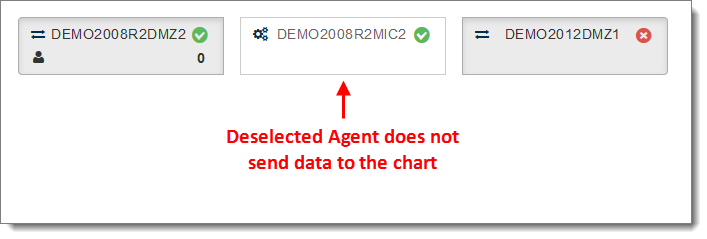
The chart includes data only from the MOVEit Agents you select in the dashboard. Select an Agent to show or hide its data in the graph below.
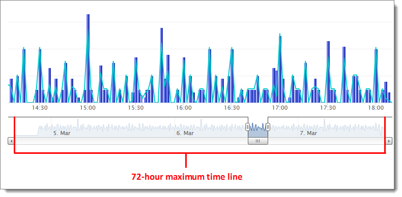
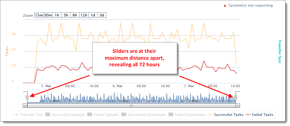
A 72-hour time line at the bottom of the chart shows the maximum amount of time that can display in the chart.
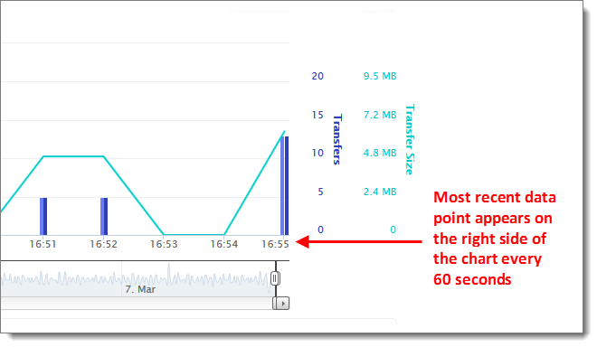
New data points add to the right side of the chart every 60 seconds. The last update shows at the bottom right.
ADJUST TIME RANGE OF DATA SHOWN IN CHART
When you first open the Monitor, only data for the past 15 minutes display in the chart, as indicated by the blue shaded area in the time line at the bottom of the chart. The blue shaded area in the time line indicates the time range of data displayed in the chart.
You can adjust the time range of data displayed in the chart by doing any of the following:
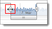
Move the sliders in the time line:
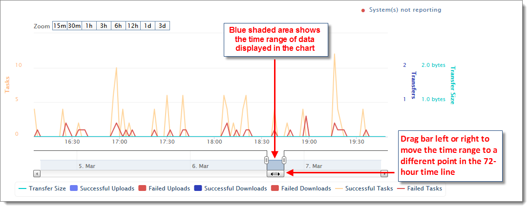
Drag the slider bar left or right to move the time range to a different point within the 72 hours. The chart data updates to show the new time range.
You can also drag one or both sliders in the time line to new positions to create a custom time window.
Drag the sliders their maximum distance apart to display the full 72 hours in the chart:
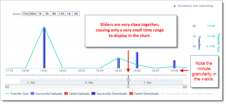
Move the sliders closer together to narrow the time range. This can help you focus on a specific time range of interest:
Zoom to a preset time range:
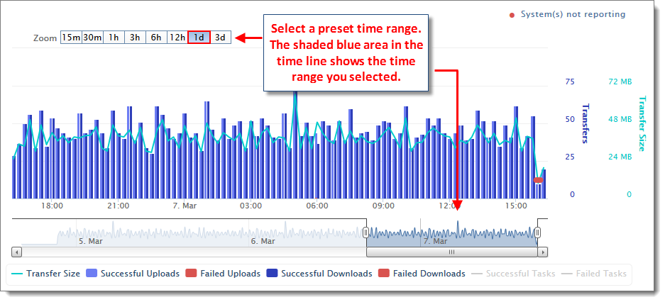
Zoom options range from 15 minutes to the entire 3-day window. The selected zoom displays in blue.
Click and drag inside the chart with your mouse:
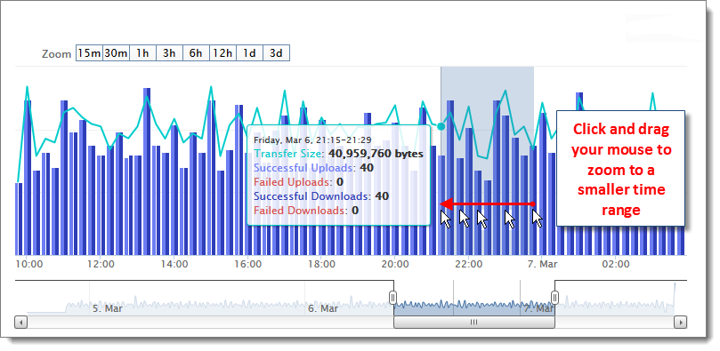
You can drag your mouse either left or right inside the chart.
Note: This method only works if you want to view a SMALLER time range; you cannot click and drag to view a larger time range.
Whenever you adjust the time range with the methods shown above, the horizontal x-axis updates to display data for that time range only, and the vertical y-axis on both sides of the chart also updates to show a value range that is appropriate for the selected time range.
VIEW DATA POINTS
Hover your mouse over any time point to view all data available for that time point:
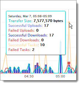
You may not be able to see small values if you select a large time range, or if other values within the time range are disproportionately large. For example, if the 1:24 pm time point has 12,780 successful uploads but only two failed uploads, the vertical bar showing the two failed uploads will probably be too small to notice on the screen. To isolate small values of interest so they are more easily visible in the chart, select a smaller time range, or hide all other data metrics using the interactive legend (explained below).
Note: All times display Greenwich Mean Time (GMT).
SHOW/HIDE DATA TYPES IN THE CHART
The chart includes the following transactions from your MOVEit server(s):
Each data type has a different color in the chart for easy identification, with an interactive color legend below.
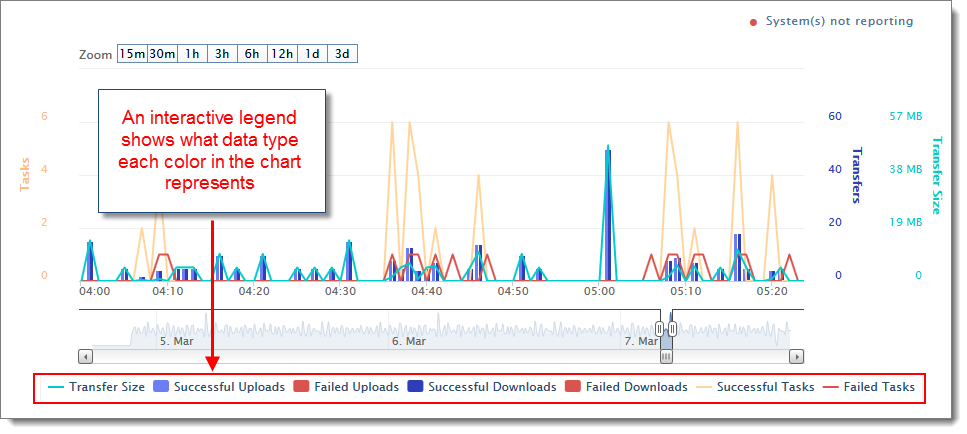
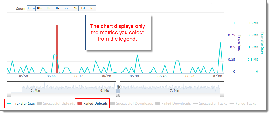
Click a data type inside the legend to show or hide that data type in the chart. This is useful for isolating transfer and task failures, abnormal behavior, and other items of interest. For example, you may want to hide everything except Failed Uploads on a specific MOVEit Transfer server.
Note: Successful Uploads and Successful Downloads display side-by-side within each time point.
Note: If you select only MOVEit Transfer Agents in the dashboard, the legend grays out Successful Tasks and Failed Tasks, and the Tasks label disappears from the y-axis. Likewise, if you select only MOVEit Automation Agents in the dashboard, the legend grays out Transfer Size, Successful Uploads, Failed Uploads, Successful Downloads and Failed Downloads, and the Transfers label disappears from the y-axis. The chart always displays Transfer Size whenever at least one Agent of any type is selected in the dashboard.
AGENTS OFFLINE
If the status of at least one of the Agents is either offline ![]() or unknown
or unknown ![]() , you will see a red dot floating just above the x-axis. A single red dot may represent multiple Agents that are offline, so hover your mouse over the red dot to see which Agents are offline. You will also see a System(s) not reporting in the upper right.
, you will see a red dot floating just above the x-axis. A single red dot may represent multiple Agents that are offline, so hover your mouse over the red dot to see which Agents are offline. You will also see a System(s) not reporting in the upper right.
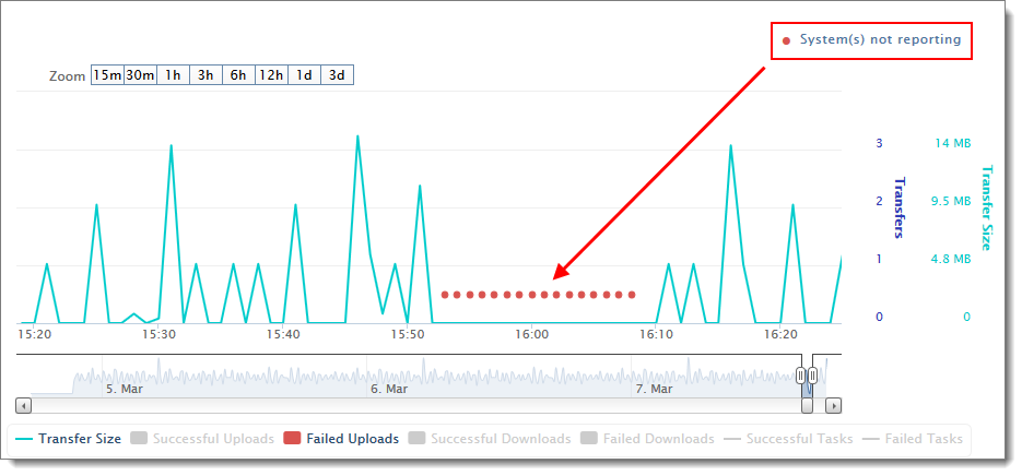
Red dots from prior minutes will remain in the chart even when connection re-establishes.
Note: Metrics may not be 100% accurate for transfers in transient states (for example, when a transfer occurs over multiple minutes). Once the transfer completes, the chart refreshes to show the final correct size and count. The chart displays a current snapshot of server activity only; once the transfer completes, the chart refreshes to show the final correct size and count for those minutes.
SAVE CHART DATA
Chart data is dropped after 72 hours and is not archived. The chart is transitory and is not meant to be saved or exported. However, chart data is obtained from the same data source as Report data, so you can also get the same underlying data from reports (in tabular rather than graphical format).
You can also preserve a snapshot of the chart by capturing an image of the screen: